
Application Redesign
Clocr
3 Months
Client
Clocr
Web Application
UX Design and UI Design
Application Redesign
Design and User research
Team
2
Ashok Gotte
Shafiqah Zulfikar
Personal Contribution
Design
User Research
Wireframing
Visual Design
Prototyping

Clocr is a content heavy estate planning application thereby the redesign project aims at fixing both UI and UX issues with the existing application in order to increase the efficiency of use by reducing the complexity.
Problem Space
My father passed away one night and in that sudden emergency, nobody knew what had to be done to his numerous online accounts and to the will that nobody was aware of. That is when Clocr was born!
"
Background :
1. Clocr has multiple online accounts and documents making it a very content heavy platform.
2. Educating users about the need to store all of one’s digital accounts in one safe space
3. Allowing users to have a peace of mind while they live, not worrying about who will take care of their last needs
4. There are still many who are hesitant to get onto to this platform, how do we break this barrier ?
- CEO of Clocr
Platform Goal
1. To create an end to end secure platform for digital estate planning
2. Provide assistance and help in planning of future and unforeseen events
Design Challenge
1
Redesigning the existing Clocr application to make it more intuitive, usable and approachable
2
To reduce the complexity by addressing issues faced by users while documenting assets and assigning beneficiaries
User Research
As this application was a working system with multiple users around the world, we first decided to conduct secondary research to understand what users have to say about the product. After gathering various positive as well as negative reviews from online sources we created an affinity map to understand what type of reviews are overpowering the others, this furthermore helped us in understanding what the main issue of the current system was.
User reviews


Key Findings
The second stage of the secondary research was to understand how the competitors are doing, what is it that they do that Clocr does not have and what are some mistakes we need to stay cautious from repeating. The following are the three applications that we conducted an in depth study on along with the key findings :


1
2
3
4
1
Sharing
Intent :
Certain information or the entire account of the digital asset owner can be shared to other family members or friends, so that they can use it appropriately
Opportunity :
The sharing levels can be different for different users and can be granted on means of the necessity. Sharing will allow easy access in times of emergency.
2
Prompts
Intent :A more interesting way for users to fill out informations by providing users with prompt questions which they have to answer. These questions are likely to trigger thoughts they might miss out in ideal situations
Opportunity :
Use these prompts to gather as much information as possible about the user during the onboarding process by giving the user pre - built scenarios.
3
Suggestions
Intent :Suggestions for users are based on personal preferences and their choices, it helps it delivering a more customized experience which in turn allows the user to not miss out on any important aspects that concerns them
Opportunity :
Suggestions can be used appropriately to guide the user about the steps he or she needs to take in order to have a complete and
4
Tracking
Intent :Easy for new users to keep track of the information they are uploading and that is needed to be uploaded
Opportunity :
Helps users understand the benefits of keeping track of the status of tasks that is being done and also giving them a peace of mind when showing completed tasks
Gap Analysis
Pain Point
Guided navigation for new users is not intuitive to take an action on how users want to view the tutorial
As the focus of this project was to redesign the existing platform in terms of both the User Experience and the User Interface, it was important to conduct a heuristic analysis of the current screens/ stages of the user journey within the application. This stage helped in getting a better understanding of the current pain points that are prevalent and also helped in formulating potential design opportunities to tackle the specific pain point.

Design Opportunity
A more clearer interface that allows users to understand how to watch the next steps of the tutorial
Current Onboarding Screen
Pain Point
List of digital accounts that the user holds and the options to edit and delete the same are not easy to understand
Design Opportunity
List view can be made more interesting and intuitive as there is a lot of content for the user to process all at a time

Current Digital Estate Screen
Pain Point
To provide information to the user about the different task performable on the page, for example adding accounts
Design Opportunity
The nomenclature is unlcear making it a time taking and trial and error process to understand the tasks to be performed
Current Digital Estate Screen
Pain Point
To allow users to edit and delete certain drawers along with being able to view the contents under the drawer
Design Opportunity
Actions can be made more clear and should allow distinguishing between the various actions

Current Drawers Screen
Pain Point
To allow users to answer questions about personal choices and preferences, enabling them to set up the digital portfolio
Design Opportunity
A more two way dialogue approach, making it more interesting to answer the needed questions

Current Onboarding Screen
Concept Development
The main phases of the concept development included creating a persona, drafting a customer journey map to understand pain points and opportunities at various touch points and redesign the information architecture to one that is more intuitive and less complicated.
Persona Analysis

Customer Journey Map
.jpg)
Redesigned Information Architecture

Key Stages
Red routes with wireframes
After conducting a heuristic evaluation, crafting a journey map and persona to understand the major pain points in the current system, the next step was to map the key activities or stages within the application that needed to be redesigned.
Onboarding - Helping users get accustomed to the platform and recording personal choices to see what features are most useful
Time Capsule - Leave messages for loved ones to access once your life on earth has ended
Digital Estate - Online repository of all the online accounts that the users possess with additional information
Legal Forms - Handle legal formalities related to the will of your near and dear ones once they leave you
Onbaording Wireframes
.png)
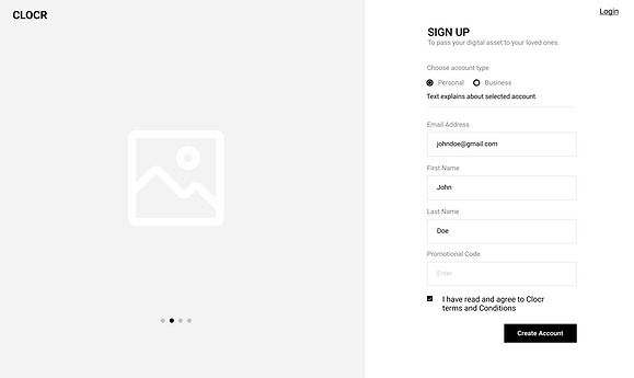
Onboarding Login and Sign up

Onboarding Personal Details

Onboarding Choosing a preferred service

Onboarding Getting started
Visual Design


.png)
.png)
.png)

Micro Interactions


Information
Input Box
Dialogue Box
Interface Illustrations


Before

Dashboard

List of online accounts

Onboarding
After

1. Clearer call to actions
2. Intuitive hierarchy
3. Multiple viewing options

1. Decluttering of Information
2. Progressive Disclosure

1. More intuitive selections
2. Visibility of system status
Impact of
new
design


80%
Reduces
cognitive
load
Help and Support readily available to make even novice users comfortable
1/2
Saves
Time by
Effortless onboarding session, with a simple feature to select multiple accounts all at once
Drag and drop feature, to make the process of adding online accounts extremely straightforward
Quick and Intuitive process for adding a single online account to the digital estate
Perdure : UI & UX Sprint